Wednesday, January 30, 2019

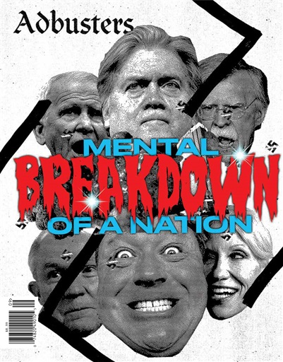
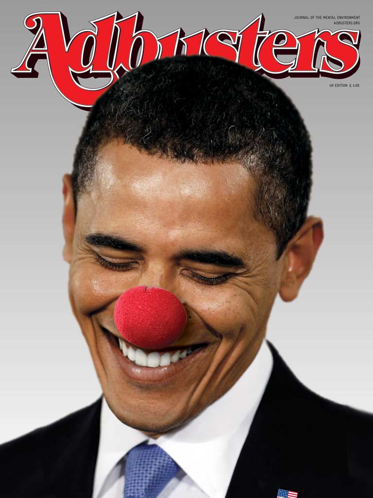
ADbusters


  • Bi-monthly magazine, published 6 times each year
  • genre is very tricky to understand (doesn't really have a genre)
  • Published in May/June 2016
  • Only studied at A-level, suggests it's deliberately harder
  • Adbusters is an anti-capitalist magazine (against the ideology based around profit and private ownership)
  • Published by the Adbusters Media Foundation (Self-published)
  • Price: £10.99*
  • Circulation is 120,000 readership (website April 2017)
  • Genre: Independent/Campaigning/Culture Jamming
  • Opposed to advertising
  • Adbusters is a not-for-profit magazine
Image result for this is not a pipe
"everything is not as it seems"
  • Images can betray us, it shows us an image of a pipe; but it's not real, it's a representation
Détournement: Hijacking/culture jamming
Parody: Making fun of the original
Related image
Related imageImage result for culture jamming
Image result for culture jamming
-------------------------------------------------------------------------------------------------------------------------

Image result for adbustersRelated image
Image result for adbustersImage result for adbusters

  • The front covers are controversial to magazines because it is unclear what the issue in each magazine is.
  • Each and every magazine issue uses a different font for the masthead. Meaning it can never build up its own brand identity.
  • Target audience is unclear
Criticism of Adbusters
  • Subversive and unconventional
However adverts are shoved in our face on TV
And show up on apps whether we want it or not
Ads lie, they make things better than they actually seem
Too many ads of the same ad make us desensitised 
Ads are advertising a brand, not a product
Makes you buy things that you don't actually need
Too easy to buy products now
Advertising can be harassing
They affect us subconsciously
Targeted adverts (Adverts thats know what your interested in)

  • Sans-serif font, the title half dissolved suggests a bomb exploded an has scattered dirt and sand across a wall. The fade has connotations to war 
  • Mid-shot: set in what seems like the middle-east as suggested by the beige background
  • Criminalised by the dusty cover
  • "post-west" relates to after effect the magazines cover showing that a capitalist society will be war-torn
  • The magazine dust suggest its old as if it was found in the dust of an aftermath
  • Brown, green beige, black, white font
  • Genre suggests its a war, 
  • Has an aggressive mode of address, emphasised by the facial expression and the way he positions his fist in the dominant image
  • The magazine lacks anchorage


Thursday, January 24, 2019

The Magazine Industry

To what extent are woman and Adbusters examples are specialised and institutionalised media productions?
Make reference to their distribution and circulation

IPC (producer of women magazine) bought it's rivals Woman's Own Newnes and Woman's Weekly Amalgamated in order to eliminate competition, this is an example of horizontal integration and conglomeration.
The IPC is now a subsidiary of Time Inc UK

Time Inc/ IPC is dominantly aimed towards middle age white people
"Woman serves the fastest-growing and most influential audience in the uk" - Women aged 40+ for woman magazine

The audience is 40+ and is for mass market (they are basic)

The magazine is explicitly telling it's audience to follow the rules of society (Hegemony)

IPC owns other identical woman magazines because it integrates all women magazines monopolising that side of the market.


IPSO is extremely similar to the PCC

George Gerbner: Cultivation Theory


  • The idea that prolonged and heavy exposure to TV cultivates. The long exposure of the idea reinforces the ideology/stereotype of that group.


Curran and Seaton: Power and Media Industries
  • The media is controlled by a small number of companies primarily driven by the profit and power
  • Media concentration limits variety, creativity and quality
  • More socially diverse patterns of ownership can create more varied and adventurous media productions
  • With this power, media producers cultivates ideologies
1985 Woman Advert
  • Aimed towards younger audiences
  • There is a prize for a car in it
  • It captures the neon colours and feel of the 80s
  • Still has a section about women
  • Aimed towards working class women still
  • IPC is now known as Time Inc, this is an example of horizontal integration, we are then left with a product which is bland and has no challengers
  • IPC is a major company: opposite of Indi or Independent 
  • They are a conglomerate
  • Sparked a monopolisation
--------------------------------------------------------------------------------------------------------------------------
  1. the words "A-level" are repeated a lot, suggesting that the target audience isn't a-level and that the magazine is aspirational 
  2. Images of simple face make-ups are generic and could be anybodies face
  3. Every face is white, that the assumption here is that the target audience is white
  4. Assumes that the target audience women like make-up
  5. The term "tactics" is symbolic for war, and that war is too looking good for attracting men, reinforcing hegemonic norms
  6. This article is forcing the audience to question itself
  7. The article heavily implies that all women have limited aspirations 
  8. Blatantly telling the audience that they are ugly by including the 'exam'
  9. If one company is creating media, there we see only one ideology
--------------------------------------------------------------------------------------------------------------------------

Monday, January 21, 2019

Alfred Hitchcock


Cultural Capital: The cultural resources of an individual, for example knowledge, qualifications, art, customs and tastes

Lisbet Van Zoonen- Feminist theory
  • He is a film director
  • Doesn't talk much about his movies in the interview but rather about English Girls
  • Hitchcock is creating a hierarchy of British women (ethnocentrism, the belief that one group of people are better than other groups of people)
  • San-serif font "they're like snow-capped volcanoes", is poetic. This simile is an example of objectification and stereotyping.
  • By repeating the image 4 times suggests he's important


Dehumanisation of women "seductive creature"

Patriarchal Hegemony


  • Mid/ close shot
  • High-key lighting reveals what she's hiding and brightens her face, connoting to being seductive and pretty
  • Shiny, glossy lips has connotations to romance
  • Blond curly hair was the hegemonic norm of beauty in 1964
  • the possessive pronoun "my" objectifies grace kelly in the caption/pull quote.
  • Direct mode of address looks at camera in a seductive way, this is further anchored by the cocked angle, sexualising the atmosphere. 

Magazine mock

How does the front cover of the set edition of Woman reflect the socio-historical context in which it was made? Make reference to the front cover and one other article from the set edition.

The Woman magazine was published in 1964, during this time, Women were more treated objectively than rather as actual people as the magazine does enforce what women (especially mothers) were supposed to do during 1964. For one on the yellow banner on the cover of the Woman Magazine, it states "Seven star improvements For you kitchen". This anchorage involves hyperbolic notations here as the use of the "seven star" exaggerates how great the magazine is, and how great the magazine will have an effect on the target audience, being middle aged married women, with perhaps children, as further in the magazine we are given clues that suggest this magazine is aimed towards mothers as it involves a photograph of a what looks like a stereotypical mother helping her son in the kitchen on page 28 of the magazine, including the line "back to school clothes". In addition this is further suggested to be in the kitchen as the caption, "improvements for your kitchen" stereotypically enforces that women should be and always should be in the kitchen.

What makes this aimed towards mothers on the front cover is the producers use of using the certain woman on the cover. In Stuart's Hall theory about representation, he states that representing certain people groups through media products, such as a magazine, enforces stereotypes of that people group, this is what can be known as cultural representation but also enforces the hegemonic norms of women in 1964. In the mid shot of the woman, the mise-en-scene is that she is white, a slight tint to her skin, suggesting tanning is a sign of beauty, in addition her brown shoulder length hair with a smooth slightly curly at the end of her hairs suggest that she is sensible as straight hair is stereotypically a sign of being formal and neat whilst frizzy is a sign of wild and craziness. She is also fake smile, pearly white teeth whilst staring at the audience. This direct mode of address suggests that she is trying to be friendly whilst showing what beauty the magazine can give you, that in society in 1964; women should always look like this according the the company publishing the magazines (IPC). 

Also her direct mode of address to the target audience (middle-age women) suggests that women should always be friendly towards one another and especially men as well. A reason why the magazine would appease men as well during 1964, because men would always expect women to be nice to them no matter what since it was the patriarchal hegemonic norm of the time. If a woman didn't introduce herself in a friendly manner, they wouldn't be accepted into society. The ideology of the producer in this case is that all women should be housewives and greet their husbands in a nice stereotypical womanly fashion.

By the end of the 60s, more women were going into higher education and women's rights were getting very popular, this may be due to them wanting equal pay as by 1960, 26,00 women were going into university and getting better jobs than housewives. This magazine was one of many that dehumanised women at the time, reinforcing hegemonic norms

In addition there are very specific roles women should follow (women are good at cooking). That they should be loyal to their husbands/that they are heterosexual. "Are you an A-level beauty" suggests that all women aren't beautiful unless they read such magazines as the Woman magazine. Women have plenty of spare time. Women have to wear make-up, in order to be attractive, you've got to be young

BAND 3 (8) C This the peer mark 

Wednesday, January 9, 2019

Woman Magazine


mid-shot
Alfred Hitchcock is a movie director who directed the birds and psycho
Mise-en-scene includes
shoulder length hair also seems sensible
brunette
well presented with a sensible hairstyle
brown eyes
attractive middle age women, hegemonically attractive
Bold text saying "Woman" stating that this is the hegemonic norm of women of 1964. The style of the font of the masthead is serif, and handwritten, suggesting the mode of address is friendly, the model is also smiling with pearly white teeth, with a fake smile.
Additionally the way she looks at the audience perhaps shows she is relatable, being relatable means that she is not dressed in beauty as if she is going to a party but rather just going into town or something, suggesting that the target audience isn't well educated and has low self-esteem
"Seven Star" shows signs of exaggeration to show how great the magazine is. Stereotypically suggesting women should be in the kitchen "improvements for your kitchen"
aimed towards working class, straight, age 30-50 women
Pinkish background enforces it's for women
"are you an a-level beauty?" is a direct mode of address, making the target audience feel bad about themselves
Binary opposition: Dark background vs the Yellow banner on the front


  • Woman magazine is published weakly
  • Published by a company called the IPC
  • Still sells magazines to this day
  • Cheap magazines 7d = 80p
  • Genre of this magazine is women's lifestyle
  • Woman magazine is aimed at a broad audience
  • It's circulation was 3 million copies
Socio-Historical context
what was going on in society at the time

Content:
  • 'extra special about men' assumes the audience like men, therefore are women
  • 'knitting' assumes the women enjoy to knit and all women do it
  • 'gardening'
  • 'back to school clothes' suggest that the target audience are mothers and are straight
  • This magazine has a heteronormative theme
Documentary
more women going into higher education
26,000 women were now going to University by 1960
Women's rights were very popular by the end of the 60's
wanted equal pay

--------------------------------------------------------------------------------------------------------------------------
Ideology: The beliefs of the producers that they are trying to give out through their products
The producers ideology is that all women should be housewives

Hegemony: A widely held belief for a certain people group
Women belong in the kitchen according to the front cover

Anchorage: Words that go along with an image to give it a specific context
"Seven star improvements for your kitchen"

David Gauntlett: theories of identity
pick and mix theory: audiences can select which ideologies suit them, and completely ignore the elements of the product.

"so any girl can assemble it quickly"

--------------------------------------------------------------------------------------------------------------------------
Reinforcing Hegemonic Norms

  1. That there are very specific roles women should follow (women are good at cooking). That they should be loyal to their husbands/that they are heterosexual. "Are you an A-level beauty" suggests that all women aren't beautiful unless they read such magazines as the Woman magazine. Women have plenty of spare time. Women have to wear make-up, in order to be attractive, you've got to be young
  2. Heterosexual women, but possibly appealing to men as thats how the male genders would've wanted women to be like in 1964. It enforces what the hegemonic norms were in 1964


The magazine encodes certain stereotypes that if you do not follow in society, you will not be accepted in society.
There is a reality to stereotypes, if someone is told something a numerous amount of times, this will enforce that 'belief' more and more. For the magazine, it reinforces a women's place in society, it reinforces patriarchal hegemony. Stating men are better than women, with the magazine also produced by men.

Voyeurism: Taking pleasure in watching someone or something
The magazine gives women the pleasure of social interaction, talking about it with your friends

bell hooks: Feminist Theory

  • argues that feminism is a struggle to end patriarchal hegemony and the domination of women
  • Feminism is not a lifestyle choice; it's a political commitment
  • Race, class and gender all determine the extent to which individuals are exploited and oppressed

Advertising in magazines

  • 1/3 of total revenues across the industry are advertising, it is therefore vitally important that the magazine and advertising content target the same audience in order that the advertising brands benefit from increased...
Analyse the ways in which the advertising in Woman constructs stereotypical representations of women, for example:
  1. Women's place in the home - wife and mother
  2. Women don't make important decisions
  3. Women are dependant on men for acceptance and protection
  4. Women as sexual objects, and inferior to men
-------------------------------------------------------------------------->
  • The copy adopts a direct mode of address which is friendly
  • This soaps will show you kindness, like a gentleman
  • The very first sentence is an example of interpolation
  • This advert makes big claims about what women actually are, that you are not attractive if you don't buy the soap
  • She is stereotypically attractive, full breasts, slender body, hourglass figure.
  • Her body is being used to sell the body, that if you use the soap, you'll get her body shape/style
  • She is an aspirational figure
  • The advert is not meant to sell a product but rather a lifestyle, that of course appeals to men.
  • Sexual objectification, all we know about her is a object purpose, only for the product to be used upon.
---------------------------------------------------------------------------


  • Man is pleased by how the woman looks after putting on the make up. Sexual tension, in some ways this advert is subversive, she potentially is rejecting this man, or rather that he is stalking the woman.
  • Serif font "beauty at a moment's notice..." suggests a stereotypical feminine type of beauty of it, aimed towards women, also a tagline and suggests it's easy to use.
  • Assumes that the only thing women are shopping for is make-up and are doing it everywhere they go.
  • The layout is much like a comic and presents a storyline, the use of panels creates a sequential narrative
  • The title being at the bottom supports the z-line theory, presenting everything in a straight possible way
  • "at a moment's notice, putting on make-up is hegemonically the right thing to do, it assumes that women not wearing make-p is not attractive
  • This advert creates a clear insecurity to the target audience, manipulating the audience, thinking that they are ugly.
  • The compact mirror is an essential part of the narrative, suggesting that she can see the man and is smiling
  • Being in black and white suggest classiness, restoration of the equilibrium, presenting as if it's the happy ending of a romantic film, intertextuality
How can the ad effect men?
  • Men are expected to approach women, and women should not approach men
  • Men cannot wear make-up and women should
  • Men should be constantly formal, wearing suits and looking professional all the time
Pros to stereotypes
  1. Provides a solution to make certain people groups happier
  2. Allows producers to target a target audience
  3. It makes it much easier to make a product
  4. Can be used to make a profit
  5. In a patriarchal society, women are safer, don't need to go to war and have men to protect them
  6. Uniformity, can make life a lot easier
  7. It is possible to have a positive stereotype, e.g men are strong "man up"
  8. Stereotypes help us make sense of the world 
Brand identity
How businesses presents itself to its consumers and how it wants to be perceived

Vogue has more sexual connotations with thick lips and styled out eyes that are sharp
Woman is less sexual and more aimed towards women who have gone through that hegemonic age of looking for men and are rather housewives.
High production values
On vogue, the focus is on the model, the text blends in with the dress so it doesn't distract you from the woman
Woman magazine, cover lines are very large and visible
Vogue assumes that the audience has cultural capital as they should know what the price is, since you need to squint to see the price

Vogue is more full colour and glossy, whereas Women is more dull
Vogue is £4.50 and Woman is 50p.
Direct Mode of Address for Woman is aimed towards working class age 30-50


  • Vast majority of the magazine is on women however this article is on men. This is not however a regular feature.
  • The enlarge font of "MEN" suggest men are superior
  • This article's purpose is how to get it's target audience (heterosexual women) a man.
  • The representation of women is Woman magazine are fairly stereotypical
  • The reason being that women are meant to make happy. This article reinforces patriarchal hegemony
  • This article reinforces binary opposition
  • The advice in the article is accepted by the reader, showing Stuart Hall theory of reception.
  • The article is giving the audience vital information
  • The man doing his tie reinforces a man in his right place and a woman in his right place
  • A critique of arrogance, "'Man's is creations masterpiece but who says so?' -Man", Taking the piss out of men
  • On the dominant image, it shows the woman having power, Subverting stereotypes of patriarchal dominance, and the man is doing a stereotypical woman pose. There is also binary opposition with the man wearing black and the woman being in white.



Monday, January 7, 2019

Back to Basics: 2019

Denotations: everything you can see


  • Red: setting
  • Attractive White Woman
  • Black: mise-en-scene is that she has black hair and dress
  • Loreal: Brand
  • Shampoo bottle: symbolic code
  • Hand: gesture
  • Glossy hair: mise-en-scene, iconography
  • Words: Slogan, details
"expert for damaged hair" san-serif text
Mid-shot

Connotations: This relates to that, this means that

  1. Romance and love
  2. Ideal women of beauty, target audience is middle age white women
  3. black signifies formality, elegance and authority
  4. Loreal brand font presents order combined with craziness
  5. Hand signifies she doesn't want men following her or that she can handle herself, also shows direct mode of address.
  6. glossy hair
Intertextuality and mise-en-scene is a reference to a classic romance film

San-serif bold font of 'paris' has reference to romance, fashion and love

The light colours have connotations to being innocence, purity
the red colours have connotations to being, romance, love and sex

This advert has a binary opposition between love and innocence

Adverts by making the audience dissatisfied with their lives, and that the products can fix that


  • pink shades: crazy cool, epic, mocking
--------------------------------------------------------------------------------------------------------------------------
COMPONENT 2
  1. Media Language: terminology
  2. Representation: how its presented
  3. Audience: what they see
  4. Media Industries: who owns it
compared with the past, Gauntlett argues that the media today 'we no longer get singular, straightforward messages about ideal types of gender identity'

Evaluate the validity of this claim with reference to the set editions of woman and Adbusters and the historical contexts in which they are produced.

Stereotype: a wildly held belief of a certain group of people

ROLAND BARTHES
SEMIOTICS
  • Codes such as Proairetic, Hermeneutic and symbolic

CLAUDE LEVI STRAUSS
STRUCTURALISM
  • Binary Opposition
The way which magazines work are that they are specialised industries, completely different to everything, including newspapers

Magazines are mainly gossip, have a smaller audience and have a specific interest.
They are less focused on general current affairs and have glossy covers\

Magazines have a smaller circulation
Circulation: how many copies are produced and sold