- Adbusters lack articles, it doesn't have a clear demarcation.
- Brings up topics that other magazines don't have.
- The layout is sparse, huge elements of white space.
- Woman is monosemic, simple and straightforward.
- Adbusters is deeply Polysemic, the white space could suggest that life is boring or that it represents that news articles are useless or that you could write anything in them.
- There is an emphasis on photos and not much writing
- Similar to high-end fashion magazines by criticising them
- Adbusters are anti-consumerist however their merchandise shop shows commodity fetishism, which is hypocritical
- Adbusters has no adverts, it's anti-commercial and anti-consumerist
Groups of people represented in Adbusters
- Poor people (poverty)
- Depressed People
- Upper class people (consumerism)
- Black people
- Men/Women
- Old/young people


Roland Barthes
- Proairetic: refer to something within a media product that suggests something will happen.
- Hermeneutic: refer to something in the media product that creates mystery or suspense
- Why are they behind the barbed wire in the first place
- who are wearing those shoes, this high-angle close-up creates a lot of mystery
- Symbolic: Something in a media product that creates a deeper meaning in the audience.
- Mocking rich clothing brands with the pun "LouiBouton" refering to louis vuttion, this is a parody. It is also stereotyping that this is an african kid by the colour of their skin and the dry ground
- The people behind the barbed wire suggests their immigrants
- Referential: refers to another source of media product
- Clear reference to LouiBouton, used without permission, this can relate to Water-aid
- The ad criticises people who buy louibouton shoes and that it causes people to be put in poverty. This can increase the inequality of the world
Target audience for Adbusters is middle-class, assuming that they have a high-level of education
Assumes that the audience is media-literate
Presenting an anti-consumerist ideology: criticising a high-end luxury brands
Lacks anchorage
Claude Levi-Strauss
- Binary Opposition
- between the rich and the poor, the"Louibouton" logo to the ragged shoes.
Adbusters is an anti-capitalist magazine
- Black and white has connotations to sadness
Bricolage: When different things are put together
Adbusters looks like it has low production values
Commodity fetishism: The process of ascribing magic "phantom-like" qualities to an object, whereby the human labour required to make that object is lost once the object is associated with a monetary value for exchange.
Marxist belief: a struggle between the working class and the ruling class, and that the working class are being controlled by the ruling class.
Believe that the rich control the world to get the rich richer and the poor poorer.
Lacks anchorage
Détournement: Hijacking/culture jamming
Positioning: how a magazine positions its target audience in it's articles
Nihilistic/Nihilism: The belief that the world has no meaning and there is nothing to live up to
- Low-quality image of the feet suggest low quality of life and poverty of Africa
- the mise-en-scene of the unclean feet give a message about African people
- By the grossness of the image, it suggests that the target audience are sympathetic
- Stereotypes allow more people to relate to an image/scene
- Criticising Loubouton
- High-angle close-up shop makes us uncomfortable


- Binary opposition between luxury and blandness/death yet again
- left image connotes sadness and the high-angle shot shows she is vulnerable
- The representation of wrinkled hands and tattoos is unconventional and not sexualised
- The preferred reading is that we are supposed to find this woman vulnerable
- The tattoos stereotype suggest she's not cultural capital but rather working class
- the frame also suggests the magazine is trying to cover the image as if this is what actual magazines try to cover in their photos.
- Magazine is highly polysemic, yet it lacks anchorage
- The entire double page spread is all hermeneutic
- Detourment is showing that zucchetti is cruel

- There is no attempt at a visual aspect in this article
- This makes you more concentrated on the text instead of anything to distract you
- It adopts this mode of address to make you think about what you read, stating that everything you do in your daily lives ruins the environment
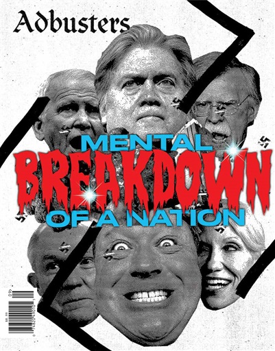
- The title is attention grabbing- the effect may be that the audience may kill somebody
- Big issue for IPSO, potentially for people suffering from such examples as depression may do such a thing
- The faded, smashed-up title is a symbolic code of the world we live in is completely screwed
- "chapter 1" is very unconventional
- article adopts a sophisticated lexis mode of address, assumes that the audience is educated
- Positioning is a direct mode of address, the articles makess the audience have all the blame and guilt.
- language is emotional and blunt, not poetic.
- It's nihilistic: belief in nothing
- Nihilistic/Nihilism: The belief that the world has no meaning and there is nothing to live up to
Contextual Factors: Background information
ADbusters are against adverts, they believe that adverts are misleading and promote a false ideology, they also do not like the idea of consumerism
ADbusters are against adverts, they believe that adverts are misleading and promote a false ideology, they also do not like the idea of consumerism
For a magazine, adbusters doesn't show many text
Adbusters has a dark and controversial subject matter
Adbusters is only one of two texts that are not for profit
Curran and Seaton: Power and Media industries
There are a few different companies who own all of the other companies
- "Audiences are made"
Livingstone and Lunt: Regulations
The rules and regulations a media product must follow
IPSO- British
--------------------------------------------------------------------------------------------------------------------------
Digital Convergence:

Buy Nothing Day

Buy Nothing Day
- Anti-consumerism
- Very difficult to do
- This page is an extract from a book
- It is unconventional, it shows that there wasn't much commitment to the page
- but there are elements that are conventional such that it has a letters page
- Adbusters is actually not as atypical as it's supposed to be
- Adbusters criticises big organisation
- Adbusters is produced
- Non-profit organisation
- Propaganda reinforces beliefs we already have
- target audience is:
- liberal
- open-minded
- young adults
- middle-class wealthy aspirational audience