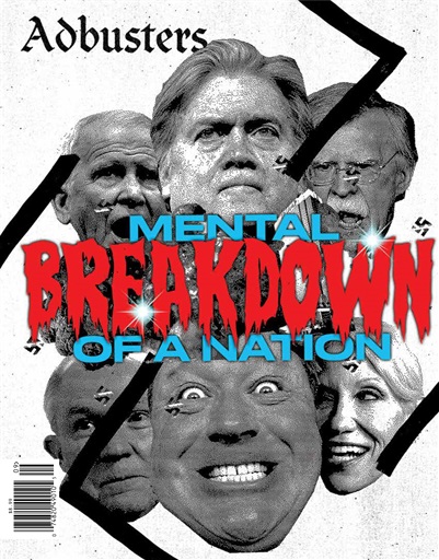
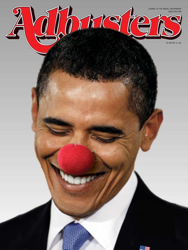
- Bi-monthly magazine, published 6 times each year
- genre is very tricky to understand (doesn't really have a genre)
- Published in May/June 2016
- Only studied at A-level, suggests it's deliberately harder
- Adbusters is an anti-capitalist magazine (against the ideology based around profit and private ownership)
- Published by the Adbusters Media Foundation (Self-published)
- Price: £10.99*
- Circulation is 120,000 readership (website April 2017)
- Genre: Independent/Campaigning/Culture Jamming
- Opposed to advertising
- Adbusters is a not-for-profit magazine

"everything is not as it seems"
- Images can betray us, it shows us an image of a pipe; but it's not real, it's a representation
Détournement: Hijacking/culture jamming
Parody: Making fun of the original
Parody: Making fun of the original


- The front covers are controversial to magazines because it is unclear what the issue in each magazine is.
- Each and every magazine issue uses a different font for the masthead. Meaning it can never build up its own brand identity.
- Target audience is unclear
Criticism of Adbusters
- Subversive and unconventional
However adverts are shoved in our face on TV
And show up on apps whether we want it or not
Ads lie, they make things better than they actually seem
Too many ads of the same ad make us desensitised
Ads are advertising a brand, not a product
Makes you buy things that you don't actually need
Too easy to buy products now
Advertising can be harassing
They affect us subconsciously
Targeted adverts (Adverts thats know what your interested in)
- Sans-serif font, the title half dissolved suggests a bomb exploded an has scattered dirt and sand across a wall. The fade has connotations to war
- Mid-shot: set in what seems like the middle-east as suggested by the beige background
- Criminalised by the dusty cover
- "post-west" relates to after effect the magazines cover showing that a capitalist society will be war-torn
- The magazine dust suggest its old as if it was found in the dust of an aftermath
- Brown, green beige, black, white font
- Genre suggests its a war,
- Has an aggressive mode of address, emphasised by the facial expression and the way he positions his fist in the dominant image
- The magazine lacks anchorage


No comments:
Post a Comment