Wednesday, October 31, 2018

Stuart Hall- Reception Theory


Image result for adidas leg hair ad

Adidas Leg hair Advert

-Hegemony, the rules we follow in society
-We conform because it makes life easier

This advert is breaking gender stereotypes
This is breaking hegemonic norms
"distasteful"

Adidas was trying to put affront that girls having leg hair is normal but it didn't turn out well

--------------------------------------------------------------------------------------------------------------------------

Stuart Hall- Reception Theory

When we receive something we are given something
Hall suggested that there are 3 different ways to view a media product

1. Preferred Reading: The right reading of a media product, which can be enforced by positioning

This concept has to be approached carefully often texts(media products) intentionally have multiple meanings.

1. Dominant Reading: The audience agrees with the dominant values in the text, and agrees with the values and ideology it shows.

2. Negotiated Reading: The audience generally agrees with what they see, but they may disagree with certain aspects

3. Oppositional Reading: The audience completely disagrees with what they see, and rejects the dominant reading

4. Aberrant Reading: When the audience completely misunderstands what the text is trying to present

--------------------------------------------------------------------------------------------------------------------------

Con-Air
Image result for con airNicolas Cage in this movie was sent to prison because he killed a man, that might be oppositional reading because they would think he's a bad man but the movie suggests to be comedic and the preferred reading is that killing the really bad prisoners is a good thing.

A negotiated reading might be that it is action packed and ridiculous, even though in real life it would be a terrible thing to happen.


Image result for gucci guilty ad
Celebrity endorsement: Chris Evans encourages people to buy the product
Sexually suggestive, use of low key lighting connotes sex intertextuality, suggest romantic films
The dominant reading is the that we are meant to want this lifestyle, that the most important thing in the world is sex.
Oppositional reading is that such religious groups may not like how sex is presented in this way.
These people are stereotypically attractive, tanned skin, blond hair, blue eyes, people who are gay may not find this attractive. The connotations of tattoos are that you are rebellious.
Direct Address w


Monday, October 29, 2018

Key assessment 1


Key Assessment One

What is…

Ideology
The beliefs and values of a media text

Intertexuality
Relationship between texts

Positioning
Where and how people are placed within an ad/poster

Lexis
The choice of words used

Diametric Opposition
Being the complete opposites of one another

Paradigmatic feature
A typical example of a stereotype etc

Tide Ad
The ideology of this advert is that the producers believes that all women work in the kitchen and that is enforced by how many times the “house wife” is shown on the poster. This poster came out in the 1950’s, a time when woman didn’t get as much equal rights as they did today, forced to stay in the house and work. Examples of this hegemonic stereotype include her apron, poke dot blue shirt, hair pulled back by a bandana, heavy amounts of makeup such as heavy red lipstick, significant mascara and fluffed up cheeks.

 This is what’s known as a paradigmatic feature of society back in the 1950’s, when women were seen as not as powerful as men, additionally her pursed lips is a proairetic code that signifies she is in a relationship, has a husband, therefore further enforcing that she is less powerful. This ad additionally was made by a group of men, yet even more distancing women as people and more as workers.

With men creating the ad, their mode of address towards the target audience, using such language as informal and colloquial. Some examples include “no wonder you women buy more tide” The use of the pronoun, “you” directly points towards women and not men, that it is a woman’s duty to buy tide and use in, also the lexis used in “no wonder you women” highlights that women are naïve and dumb, that they buy tide just because they know exactly what’s in it further invokes the stereotype that women know everything about washing as they live it.

The positioning of the ‘housewife’ furthermore reinforces the fact that the female gender loves doing the house work, The way the housewife hugs the Tide box present her as if she is deeply in love with it, moreover her pursed lips also presents her as if she is about to kiss the box. What the producer is trying to say is that his ideology is that all women like cleaning.

Wateraid ad

One key component about the advert is that it deliberately went away from the stereotypical archetype that all Africans are miserable and are very poor with a lack of clean water; this all juxtaposes the representation of African adverts. In the ad we have a young girl named Claudia walking into a small stereotypical African village in the middle of the day to collect water, she also sings throughout the ad with people joining in as she enters the village, the ad finishes off with the ad saying that millions of people don’t have access to clean water and asks us to help contribute. Claudia is a working class/ young/black female, but what’s interesting is that its non-stereotypical representation of a black teenager, it is rather positive for a girl like her living in a poor nation in Africa. This is further brought out by the colourful, bright colours, the many happy children and how peaceful everything seems. Although their town is in a very poor situation, it is polysemic, being uplifting as well.

The producer here is subverting what society in the UK believes Africa is like buy making sure everything and everyone is uplifting. The producer may have done this to make sure the target audience isn’t unhappy because usual charity adverts shows disturbing videos of poor children with diseases or in poverty, here though, wateraid producers leaves a resolutely positive ideology to its target audience.

Additionally Claudia sings, an upbeat, catchy, positive song. As she reaches the village, all the people join in the song, this symbolizes community, friendship and cooperation. Which is what the producers want the target audience to do, to help by cooperating with wateraid to make people’s lives as happy as Claudia’s in poor nations. This diametric opposition helps assist that children’s lives can be so much better.

Representation

When we think of sci-fi movies, we would think of star trek, star wars etc, all this movies have one key component, that men such as Piccard or Luke Skywalker are the main protagonists, but in the Movie poster for Annihilation, this doesn’t seem to be the case, we have an all women lead with Natalie Portman and etc. The mise en scene here is that they are all positioned like they would be in a star wars poster, but none of them are princess to be rescued. The costumes help subvert the stereotype that women are weak by having them wear army like clothing with heavy weaponry and leather green coats. The massive gun that the figure in front is holding also reinforces that women have the power to wield a gun and are super tuff as we associate guns with being muscular and buff.

The scenery in the background seems to be hermeneutic, with all the different colours, texture and creatures within the background creates mystery about what their voyage is going to be. We associate this with scary movies where the stereotype is that woman are usually the ones that have to be saved or rather die in a very sexualized way (especially in old horror movies). But here it’s different, with the women leading the charge. Such examples emphasizing my point include .

Wednesday, October 17, 2018

Louis Vuitton Analysis


  • The genre of this poster seems to be of a holiday and could possibly be a comedy as we associate this poster to many movies where 60-year old men on holiday to be very funny. Some examples of this can be Mamma Mia and Dirty Grandpa. Additionally it also connotes to being a spy movie since the hegemonic code is that most spy movies occur around a tropical paradise
  • We can tell this is aimed towards 60-year old men by the mise-en-scene; the mise-en-scene of a man with white and grey hair with a big moustache, combined with the casual clothing is associated with being classical, wealthy and stereotypically for the older white ethnic groups. 
  • This cultivates that all old white men are wealthy since the brand "Louis Vuitton" is of course associated with being rich and wealthy
  • The milky lighting of pale whites of the sand and hat, light blues of the sky and the calm and lucious greenery of the island are contrasted with murky, dead wood and his black jumper. The reason we can tell this could be an island is the hegemonic norm that all island would be tropical and a dreamer's paradise
  • The scenery makes the mise-en-scene very serene, calm and jolly. This additionally reinforces that 
  • Whats interesting is the subtle way of including the brand in the poster and the plain and simple logo in the bottom right corner. The font used for the logo is straight forward, bold and easily visible to notice; this bold font suggest that it is trying to be very formal and mature meaning that the product is aimed towards more mature audiences such as 60-year old men. Furthermore the subtle way they enforce the brand in the bag, blending it with the dock and being casually placed next to the older man suggests that older, white, wealthy men have the power to casually use an expensive bag like its just a backpack or a plastic bag. We can conclude that Louis Vuitton deliberately did this to show the powerful nature of older men and how wealthy they are to wave around an expensive bag
  • What is atypical about this ad is the producers use of using a 60-year old man. This use of older men is strange as we associate Louis Vuitton adverts including young male and female actors. This change in age suggests that older men to be very powerful and mighty since they are associated with being wise, humorous, strong and classic.

Monday, October 15, 2018

Hegemony & Cultivation


Albert Bandura

The hypodermic media model: That mass media has a large effect on the audience
This is a theory of a passive audience
This theory is absolute nonsense, some people are influenced by media products in a very blunt way
An advantage is that children do easily copy what cartoons do sometimes


George Gerbner

Cultivation Theory: The idea that prolonged and heavy exposure to TV cultivates. The long exposure of the idea reinforces the ideology/stereotype of that group.


  • Television present a mainstream view of culture, ignoring everything else
  • In doing so, television distorts reality
  • Heavy television users are therefore more likely to accept this edited and distorted view of reality
Flaw: 
  • Not everyone watches the excessive amounts of TV
  • It's distressingly similar to the effects model
  • May of been helpful in the 1970's where there were 3 channels but today there are hundreds. This no challenges that any ideology can be mainstream
\________________________________________________________________________________/
Both of these theories are Passive

The Tide Ad cultivates the stereotypical ideology that woman work in the kitchen and do the washing
It also cultivates that women should stay at home.
And that it cultivates the ideology that wearing make-up makes a woman very attractive.
Additionally that woman talk to much with all the text

Hegemony: Where one group wields power over another, not through domination, but through coercion and consent

Example: The School System, drinking underage with your 18-year old friends, the use of money, parent rules, Cutural, political, patriarchal.

Non-Hegemonic power is the opposite of Hegemonic power
Example: Military Conquest

--------------------------------------------------------------------------------------------------------------------------
Coca-Cola Ad
  • would class them as attractive, because having skin showing can be classified as attractive
  • They are also skinny and have no blemishes
  • Strappy tops 
  • From an hegemonic perspective that society of woman should be skinny, laid-back and wearing strappy-tops. The ideology of the producer is that they need to look like this to be attractive.
  • The use of setting symbolises wealth
  • If we see this representation of women over and over again, it reinforces the stereotype of woman
  • This representation of young women suggests that women are always out having fun
  • It is most important to relax
  • Sun-bathing on a roof in a city is normal
  • Target audience is young women
  • The ad is that if women drink coca-cola, they will be attractive. It is aspiration. If you cannot live up to this, you are not on this level
--------------------------------------------------------------------------------------------------------------------------
Image result for advert

Thursday, October 11, 2018

Audience

Component 1

Section A:
Media Language and representation
  • Hermeneutic Codes
  • Analyse of what media products mean
  • Mise-en-sene
  • Colour
  • Genre
  • Shot, mid, long, wide
  • Costume
  • Representation of groups
Examples
  1.  Tide Ad
  2.  Kiss of the Vampire
  3.  Water-aid Ad

Section B:
Audience


Examples

  1.  Tide Ad
  2.  Water-aid Ad
--------------------------------------------------------------------------------------------------------------------------

AUDIENCE

Every Media product is created to match a particular audience's expectations
It is assumed by many that Media products influence their audience, Media amplification
Audience are easy for manipulation

Target (Primary) Audience: A specific group of people that a media product is aimed at.

Secondary Audience: The 2nd audience that is targeted in mind by the producer

Decoding-Encoding model
  • Targeting
select as an object of attention or attack.
  • Attracting
cause to come to a place or participate in a venture by offering something of interest or advantage.
  • Reaching
Is to extend to a different audience
  • Addressing
speak to (a person or an assembly). Mode of Address
  • Constructing
form (an idea or theory) by bringing together various conceptual elements.


------------------------------------------------------------------------------------------------------------------------------------------------------
Image result for The last of us cover

Natural and murky lighting has connotations towards an apocalypse, we can tell this due to intertextuality.
Low-key lighting creates a hermeneutic code, suggesting mystery

Looking back suggests they're in danger, the dutch tilt in the camera all creates mystery, hermeneutic

The use of the sans-serif font covers a third of the cover

The second character appeals to 40+ year olds

The girl appeals as a daughter figure

Weapons are atypical, girl is atypical

Intertextuality: The Road, I am Legend, The walking Dead, Zombieland

The verisimilitude is that we see a young woman in the apocalypse, we don't usually see this
non-stereotypical representation of women

Genre: Apocalypse, adventure, action, horror, hints of western


Related image

Wednesday, October 10, 2018

Photoshop


This was my first shot at using photoshop ever, not the best ad but an alright try.


Learning Conversation


  • What do you think has gone particularly well so far this year? What are your strengths?
  1.  Genres
  2. Stereotypes
  3.  Cinematography
  4.  Narrative Equilibrium
  • What is stopping you from achieving your goals? What threats might you face, (for example not enough time, lack of organisation, pressure from other subjects...)
  1.  For one it'll be the remembrance of many key words and people 
  2. how to answer exam questions the right way
  3. Times, lack of time, etc
  • Identify 3 specific targets for yourself for the rest of this year. They can be both academic and organisational goals.
  1. To organise myself much better e.g times to revise etc
  2. To maintain keeping up with hwk and not falling behind
  3. To achieve the grades to get to Uni
  • What grade do you want to achieve in media studies?
Hopefully an A but since right now that may be unlikely, atleast a C
  • Do you have any suggestions about the course?

Monday, October 8, 2018

Narrative

Narrative is the way in which a story is told
Narrative is not just the story but also the mise-en-scene

The way narratives are told help us understand the ideology of the producer

7 types of story

  • Rebirth
  • The Quest
  • Voyage & Return
  • Tragedy
  • Comedy
  • Rag to Riches
--------------------------------------------------------------------------------------------------------------------------

Tzvetan Todorov - Narratology 


Theory of Narrative Equilibrium:
Is the state of balance


  1. Establishment of equilibrium
  2. Disequilibrium (The Liminal period)
    1. The period at which everything goes bad, a lack of stability
  3. Partial restoration of equilibrium
An advantage to this theory is that it:
  • gives order to things
  •  it keeps audiences compelled
  •  easy to apply


A disadvantage is that:

  • Can be more than one disruption to equilibrium
  • May not always go in the set order e.g plot twists
  • We enjoy seeing the disequilibrium
  • The audience is always told that everything is going to be okay
--------------------------------------------------------------------------------------------------------------------------

The ideology is that audience are usually negatively bias, therefore enjoying characters getting tortured etc.

Escapism: audience do this by watching movies to get out of our foul lives 


Wednesday, October 3, 2018

Genre


Genre: a type of media product, governed by implicit rules

Hybrid genre: a combination of different genres

Sub-genre: is a genre within a genre

Generic Paradigms: aka Genre convention The building blocks of a genre, mise-en-scene, sound etc

Iconography: Stuff that makes up a genre

Verisimilitude: Every text has it's own set of rules and situations. However there are many that can break this, depending on the genre.

Verisimilitude = Reality/Realism

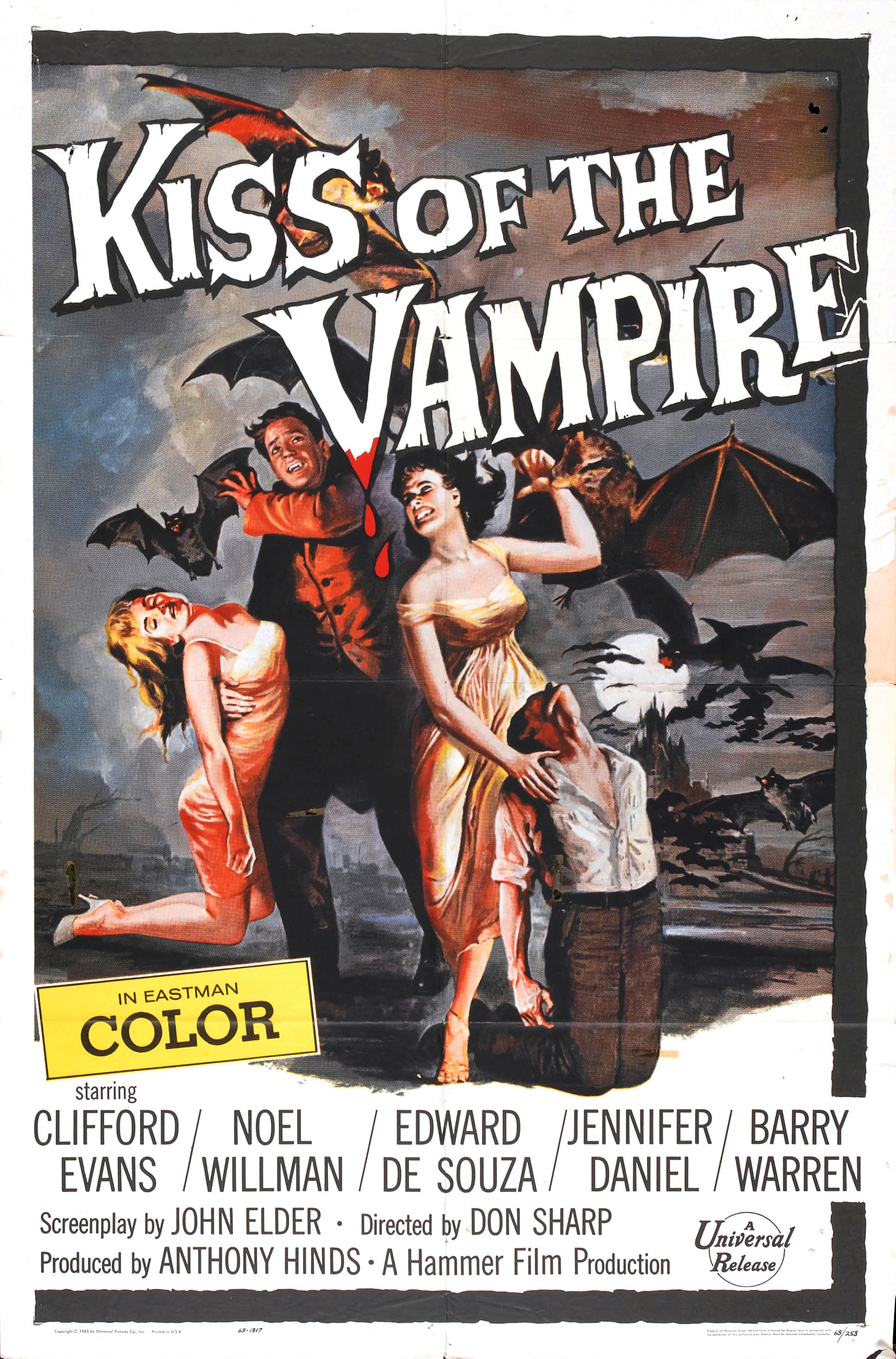
Image result for kiss the vampireIntertextuality: The shaping of a media product's meaning through referencing another product another product.

So when we watch a horror movie, we know the consequences of going into that dark room

Genres from this poster(1963) --------->


  • Horror
  • Tragedy
  • Romance
  • Serif font
  • Thriller
  • Design is that of arty and is painted suggesting it's a classical
  • Font is rooked and wonky and sharp
  • Is a hybrid genre
  • Generic paradigms include: bats, castle, the moon, the dead woman and of course the vampire
  • Low-key natural lighting is sp00ky, connotes to a feeling of suspense, a hermeneutic code
  • Mise en scene of red and black connotes to death
  • Font looks like wood and the V looks like a stake- iconography
  • The eerie and bleak and stereotypical setting
  • A typical romance narrative with a gothic twist
  • Stereotypical setting of a vampire film, gothic castle
  • Contains a wide range of paradigms


Giallo- Subgenre of gothic horror combined with detective
Danmaku shooter- subgenre of 2D games with a lot of bullets
Visual novel- game completely based on text and decisions
vaporwave- taking samples of 80s 90s music and slowing it down
Grindcore- subgenre of rock, fast hardcore punk with heavy metal


  1. Paradigms
  2. Repertoire of elements
  3. Iconography
  4. Generic conventions
  5. Conventional elements
  6. Conventions
  7. Paradigmatic features

Star Trek: The next generation
The setting is in space
The android Data
Mise en scene of futuristic technology, space-ships
Binary opposition- Humans & Aliens
Futuristic costumes


Steve Neale- Genre Theory

Repetition & difference
Believes that genre is essentially instances of 'repetition of differences'
He suggested that texts need to conform to some generic Paradigms to be identified

The Simpsons

The intertextuality of The Simpsons is to make the targeted audience to laugh
Double mode of address was used. Adults will get the reference, whilst children will just find it funny.


Tuesday, October 2, 2018

First year textual analysis mini mock


How does media language create meaning in this poster?

  • Binary oppositions

    The juxtaposition between the glow around wonder woman and the surrounding blue

    The superior woman and the average man

    The gun and sword

    Male and Female

    Blue and gold

    Ancient and modern

    Representation
     1.  Who/what is being represented?

    Wonder woman poster 2017 showing wonder woman as a powerful and independent being

     The sword is associated with being a strong, manly person, this suggests that Wonder woman is different to how people of the modern era would perceive woman with dark hair and brown-tinted skin are like. We do associate dark haired women to being nerdy, geeky, lonely etc. And the stereotype here is sort of used by how she is the only woman in the poster, but is also contrasted by how tuff she is viewed as. The position she is in, in the M/S seems to be that she is leading a charge against the enemy, her stance seems to be her running and about to strike someone down. The stereotypes are on it's head as the woman seems to be the warrior instead of the weak/always wearing dresses, being emotional and wearing jewellery all the time. Instead she wears Ancient Greek armour (which is associated with being manly), has a massive sword(connotations to being fierce and mighty) and how she contrasts with the scenery.

         The mise-es-scene in this poster is that she is positioned in the middle of the poster, meaning that she is the most important. Additionally her bright metallic reds, blues and glowing golds is a binary opposition the the cloudy blueness of the scene. We associate gold with being wealthy, powerful, hope, symbolic to being religious. Here Wonder woman is seen as the powerful being
Additionally glow above wonder woman's head could perhaps shows that she is smart and has the brains, which links back to how we associate dark hair girls with being nerdy. 

Chris Pine is represented as being the weaker of the two in the poster, he is positioned in the top-left corner of the poster, which makes him to be less important. And his rugged, dirty clothing suggests that he is of poor quality. This representation of men in this poster seems to be that they are messy, dirty, not as important as they are seen in history stereotypically. The entire poster puts stereotypes on it's head by flipping over that the woman is far more superior than the man. The producer's ideology in this case believes that woman were always far more important that they should of been, this is further highlighted by the ancient greek armour, perhaps showing that women were always more superior than men.

However we do see that Chris Pine has a gun and is dressed as a soldier, showing the stereotype that men are always soldiers whilst woman stay at home. So the poster does follow the stereotype that men are always war-players and that they are obsessed with weapons.

What is the societal impact of this message on the group being represented?

That woman are really good at being independent and are tuff beings...

Monday, October 1, 2018

Charity & Identity & Water-aid

David Gauntlet: Theories of Identity

Gauntlet believes that despite many negative perceptions of the media, audiences are capable of constructing their own identities through what they see on television.

Additionally, he writes there are now many more representation of gender than the traditional 'gender binary'

Stereotypes of men

  • Strong, buff,  manly
  • wear suits
  • do all the work
  • drive, like cars
  • leaders of countries
  • drunk
  • more comedic
  • more dangerous
  • brave

Stereotypes of women
  • always wear dresses
  • belong in the kitchen
  • smart, clever
  • women are weaker
  • always wear makeup
  • very emotional
  • elegant
  • jewellery

Representation is a construction of reality

The producer constructs these representations

They do this to encode their ideology

Manipulate - negative connotations

Charity advert

Purpose of a charity advert is that they ask for money for people in need of that money for devices that can assist them

They work by making the audience feel guilty by making it very emotional

The mode of address is quite sad and depressing, their very blunt and only want one thing from the audience

Use of low-key lighting has connotations towards darkness and death
Use of extreme close-ups shows that the audience is positioned in the room with the children, making the audience uncomfortable.
Use of sound effects like child crying makes us feel sorry
Sad and nostalgic 
the use of slow fades symbolises that the child cruelty is still continuing
The word "please" show the desperation for money
Charity adverts get played during mid-day, which means that it could be aimed towards students, unemployed, working-class and elders.
There is direct address.


'If you do not donate, you are a terrible person'


Water-aid- Deliberately went away from the stereotypical archetype
Juxtaposing the representation of Africa adverts

Is an established charity from the early 80s and is a campaign for clean water, sanitation for poor nations in Africa, Asia etc.

Shots include: Mid-shot, Close up, long shot-ish
The scene is slowly establishing the location, it starts off with her walking alone until she slowly has people joining her, perhaps suggesting she's not alone

Low C/U tracking shot of Claudia shoes establishes that she must walk far to collect water
Positions the audience literally in Claudia's shoes, allowing the audience to emphasise with her

Initial tracking shot symbolic lack of wealth. Follows Claudia as she collects water

Polysemic (multiple meanings) Both bleak and depressing but also hopeful and uplifting

Claudia is working class/ young/ black & female
Not a stereotypical representation of a 16 year old girl
Also non-stereotypical representation of black teenager. Positive!

Identity: African people are represented as cheerful, happy and carefree, yet also stereotypical

Claudia sings, an upbeat, catchy, positive song. As she reaches the village, all the people join in the song, this symbolises community, friendship and cooperation.

Clear binary opposition between the rainy season of England and the colourful, cheerful Africa
Atypical representation of Africa

M/S of Claudia walking directly in to camera, and framed by a dusty, empty landscape. Connotative of bleakness and emptiness

Conventional(what is generally believed) vs subversive(Changing that belief)

Costumes- Colourful, yellows, pinks are associated with happiness and positivity

Audience now desensitised to charity adverts. The Claudia advert presents a resolutely positive ideology to it's target audience.

Colourful, bright colours
Many children
Peaceful
Very isolated
happiness
poor but in a good way